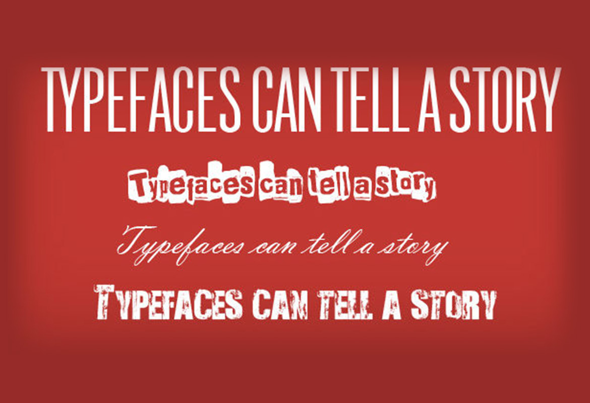
Every day we see typefaces and automatically associate the typeface to a brand, emotion, occasion or event. Typography is a visual language that can say what a product is before a word has been read.
A font is a set of characters that work in harmony together also none as typefaces, font families are a variety of fonts with minor differences in style, bold, italic and condensed to name but a few.
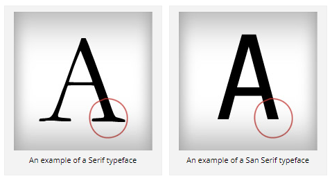
 Their are two types of font families, Serifs and San Serifs a Serif type has small horizontal details at the start and end of each character and a San Serif has not.
Generally typefaces are measure in points (pts), this system of measurement should be a guide because one typeface that is measured at 11pt can look visually smaller than another.
Leading is the amount of space between lines of type the word leading comes from lead strips that were put between sets of lines back in the old days of print, when type was set by hand in printing presses, leading is also measured in points (pts).
Letter spacing also none as tracking is the overall amount of space between letters and kerning is the space between individual letters all of which should be adjusted to make the type visually pleasing to the reader. A small tip to get this right is to imagine water pouring through the lettering; the spaces between the lettering should let an even amount of water through.


